
Redesigning YMCA’s website
YMCA
The YMCA of Greater Vancouver was founded in 1886 with the purpose of providing a place to care for the welfare of young men in the community. Over the years, the organization evolved and expanded their reach and scope of support to serve the community at large. The YMCA now has a myriad of comprehensive community programs to meet the needs of women, men, children, and families across the Lower Mainland.
Key Goals:
Increase existing and prospective members satisfaction while using the website by enhancing its utility and usability.
Improve navigation and information architecture to make information more discoverable.
Identify opportunities for improvement with regards to features and functionality.
My Roles + Responsibilities:
UX designer and researcher. Solo project.
Tools:
Google Forms, Sketch

YMCA: A UX Case Study
Discovery
To better evaluate the existence of usability issues on the YMCA site, I interviewed current members about their experience using the site. I also carried out some usability tests to gather behavioral data. Altogether, I planned and conducted 18 interviews with stakeholders, current members, and potential members in Vancouver.
2 Stakeholder Interviews
11 Member Interviews
5 Potential member Interviews
Task Scenarios for usability tests
- Imagine you want to sign up for a gym membership at the YMCA downtown, how would you do this?
- You are a mother of a 5-year-old boy. Imagine you want to go take a Zumba class while leaving your child in the capable hands of YMCA staff for the duration of your workout, can you do this?
- Imagine you want to learn about the different group workout classes available at the YMCA? How would you do this?
- Imagine you can only budget $60 a month for a gym membership. Is the YMCA an option for you?
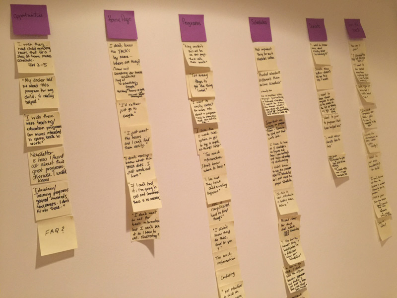
Affinity Mapping
After reviewing my notes and usability test data, I created an affinity diagram to give me a bird’s eye-view of all my findings. I was then able to organize similar ideas and pain points into different groups based on their relationships.

Personas
My initial research of the YMCA demonstrated 4 primary target audiences. Families, donors, health-buffs, and Older adults. A large majority of those interviewed were from two of these target audiences, families and health-buffs. I used the information I had learned to create 2 factual personas, one to represent each of the target groups I had spoken with.


Mockups
With all the insights I had gained, I began to mock-up possible solutions to user pain points. As the YMCA site is quite big, my mockups and solutions are based mainly on the navigation and donor page of the universal site, and homepage ,schedule pages of the Robert Lee YMCA subsite.
1 Interviewees reported being confused about some of the category names in the universal navigation. What was the difference between child care vs. child & family development, all programs vs. find a program, and what were global initiatives and youth engagement? They felt that some of the categories were not self-explanatory. When I probed further about what they meant, they mentioned that labels were not intuitive and that they did not want to “check all the pages to figure out what was and wasn’t there.”
Solution: Instead of the existing dropdown, I used a mega menu. The YMCA site is quite deep and the current menu does not emphasize clear relationships among items. Mega menus support groupings and subcategories that help users see their options at a glance, making it easier for them to decide whether a path will help them achieve their goal. Mega menus also allow for the use of icons and pictures to further convey meaning.
As a part of my research, I looked at how YMCA sites around the world were grouping similar content. Having also decided on a mega menu, I was interested to find whether any other YMCA’s had adopted this type of navigation. I was pleasantly surprised to find this in a YMCA based in San Francisco. I used them as my model and applied the same information architecture (IA) so I could test whether users would find the menu easier to scan and the IA more intuitive. Post-tests showed that users were indeed more satisfied with the new model, and had a clearer understanding of where to find the information they wanted.
2 I maintained the option for users to access schedule and program information below the fold and replaced the “welcome to the YMCA” section (that no interviewees clicked on) with the option to learn more about YMCA causes for giving.
3 Here I emphasized YMCA’s charity status along with their mission and included stats with additional information. I also added a contextual link for users to access more about specific projects.
4 Provided easy access to locations search on the homepage.
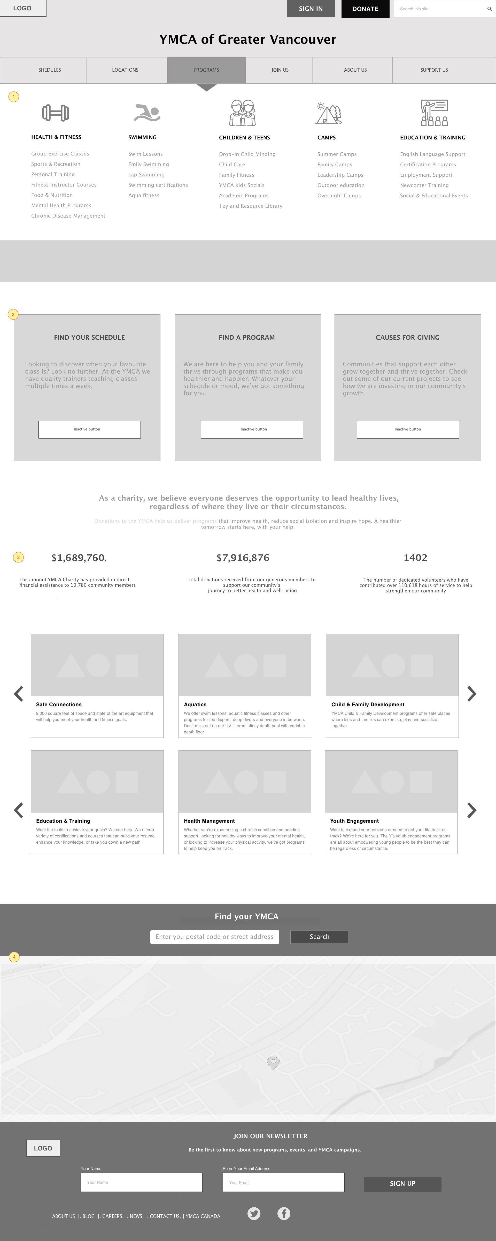

Solution: Provide location information and picture of the facility in the mega menu.
2 Search changed from a link to a box wide enough to house a typical search query. Usability studies by Nielson Norman Group have shown that users looking for search options scan pages quickly looking for a box they can type in. Making the search box more discoverable to users can enhance their experience by helping them take control over how they use the site, while also offering assistance if they are ever stuck.


When interviewees were asked what information they required to help them make their decision, 90% mentioned wanting specific information about projects related to the organization’s mission. They also wanted to know how their donations would be used.


Solution: Provide detailed information about completed and or ongoing projects. Provide details about how donations are used for each of these projects. Allow users to easily search and discover this information.
Users wanted to know the hours of operation for their local YMCA and often did not find this information quickly. They did not scroll too far below the fold (where the hours were displayed) and instead chose to continue their search by navigating away from the homepage. They gave up on their 3rd try and started googling for answers.
Many mentioned they would resort to calling for the information, but were not happy about it because they felt calling was reserved for more complex questions. 3 interviewees completed the call and heard the hours information via a recorded message. They mentioned only a slight decrease in annoyance even after achieving their goal.
*A usability study of customers interactions with organizations using various channels by Neilson Norman Group, found most customer service calls result because online channels fail to meet user needs. They report that customers’ user experience is degraded when they have to interrupt their task to contact an organization through another channel. Over time, customer satisfaction and loyalty also degrade as a result.
My Solution: Display the daily hours above the fold, and allow users to use the drop-down to access further information.
2 90% of non-members and 70% of members interviewed did not know what the YMCA really did. “It has kids programs”, “It’s a gym”, “It’s a religious organization” were some of the comments shared.
I observed users quickly scrolling past the carousel of images with the organization’s messaging, noting that only one message and picture had been visible in the frame before they had moved on. It’s difficult to form an accurate impression of what an organization does when users only see a fragment of the whole.
My Solution: Use a hero image instead of a carousel. Apply an inverted pyramid design and include a tagline that tells a more complete story about the organization.


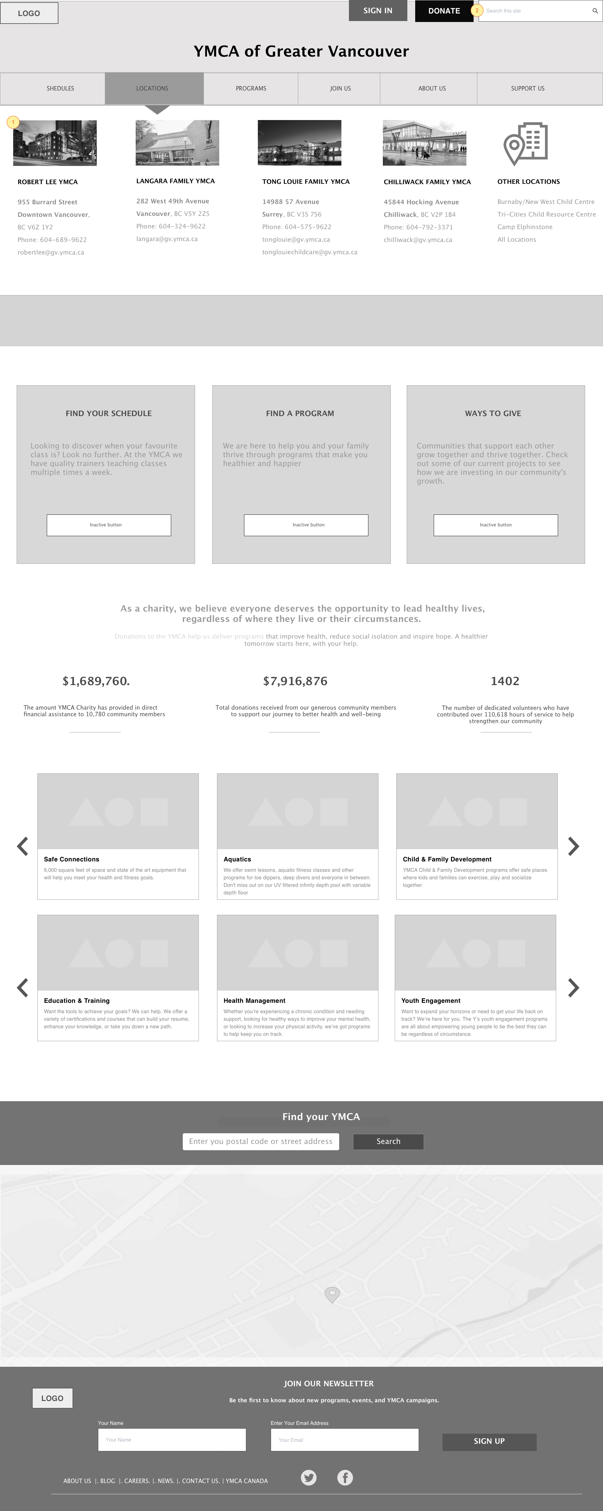
2 Users who had chosen to navigate away from the universal YMCA site in favor of a specific location, could not find all relevant information they expected about that location, for example, membership benefits & rates, without again leaving the subsite and going back to the universal site, sometimes getting lost in the process. (*Picture in colour above shows the current navigation structure of the Robert Lee YMCA)
Solution: I changed the subsite’s navigation menu based on items that were important to users (Schedules, Programs, Membership…) and what I assumed was important to the organization (Donate). I also eliminated nav options that were not populated (Events).
3 & 4 Members were most interested in schedules, hours, and programming.Non-members were also interested in location information. Most people used the global navigation links to reach their goal. However, a few did use the links provided below the fold.
My Solution: As I observed users taking different paths to reach their goal, I chose to maintain a few of the high-priority links in the same location but cut down on the amount of real estate they owned and included an enlarged map in the same row.
5 I included a section featuring different programs at the Robert Lee YMCA location. Highlighting programs with short descriptions on the homepage that are easily scannable can help new users get a better idea of the diverse programming at the YMCA (making the organization less ambiguous) and save expert users time navigating through the menu to reach the same place.
6 Finally, I highlighted the some of the main membership benefits and replaced the long text descriptions about the facility with a captioned video.
Solution 1: To ensure a sense of hierarchy while maintaining both nav bars, I initially chose to emphasize the subsite’s navigation bar by making it bigger and darker in colour, moving the now lighter coloured universal navigation bar to the top of the page. After testing, I found that while all users now noticed the subsite’s navigation, the common labels in the nav bars resulted in a few wondering whether the information would be different between the two. (*1st wireframe shown on the right)
Solution 2: To give users an easy way back to the main site but reduce cognitive load due to multiple navigation options, I included the universal sites logo (YMCA of Greater Vancouver) at the top left corner of the page. This resolved the problem of competing navigations, while still providing an exit sign for users who wanted it. (*wireframe shown below)


1 Users have an easy way back to the main site
2 Users wanted to see the facility’s hours of operation on the schedules page. They reported feeling frustrated that they had to predict when the gym would close based on the last class on the schedule, or leave in between planning their workout to search for this information elsewhere.
Solution: Include an option to view hours using a slideout drawer.
3 Filter checkboxes allow users to prioritize what they want to view close to the top. A pagination option allows them to view further down the list. The standard view is set to 10 rows supplemented with a View All option which users like to have.
2 Both existing and non-members said they wanted the option to register for programs and classes online. Non-members looking for registration information on the website could not find it on the subsite nor the universal site. They typically clicked on JOIN THE YMCA link in the universal navigation bar and after scanning the information 2 to 3 times, reported that they still did not know how to register. “I guess I have to call them to find out” was a comment I heard from interviewees. They also pointed out that there was too much information on these pages and that they cared most about rates and registration info. ( Current ‘Join the YMCA’ page does not provide registration info and rate info shown below the fold).
Solution: Include a membership link in the subsites navigation and populate with relevant scannable information, so users don’t have to navigate to the universal site and click 3 times to get to membership information. I would change the hierarchy of information, highlighting rates and describe registration process above the fold with broken text if need be to ensure that users know there is more information further down. Below the fold is where I would highlight membership benefits and include a video tour of the facility.
3 Online registration would give users the freedom to customize their calendars and allow them to save classes and receive notifications/alerts for their saved items. Customization can enhance users’ experience by giving them control over their interactions.
4 a) Currently, the daily schedule page shows all classes and class descriptions on the page forcing users to scroll long pages to view more entries.
b) When asked what additional features they wanted to have on the website, members mentioned wanting to know which trainers were teaching group classes. Members reported having favourite instructors and wanting to take more classes with them. The problem was that unless they remembered the instructor’s schedule by memory, they had no way of finding this information online.
a) Solution: Improve readability with pagination, allowing users to choose navigation options and decide on how much information they were viewing at one time. A simpler view of classes with a ‘view details’ link gives users the option to explore further without overwhelming them with too much information that may not be of interest to them.
b) Solution: A modal shows class, trainer, and location information when the ‘view details link’ is clicked. Ratings help distinguish popularity of classes. A picture of where classes are held assists users with wayfinding. 2 interviewees new to the YMCA reported that they had difficulty finding classes with only room names to lead them for example, Hume Family Studio.
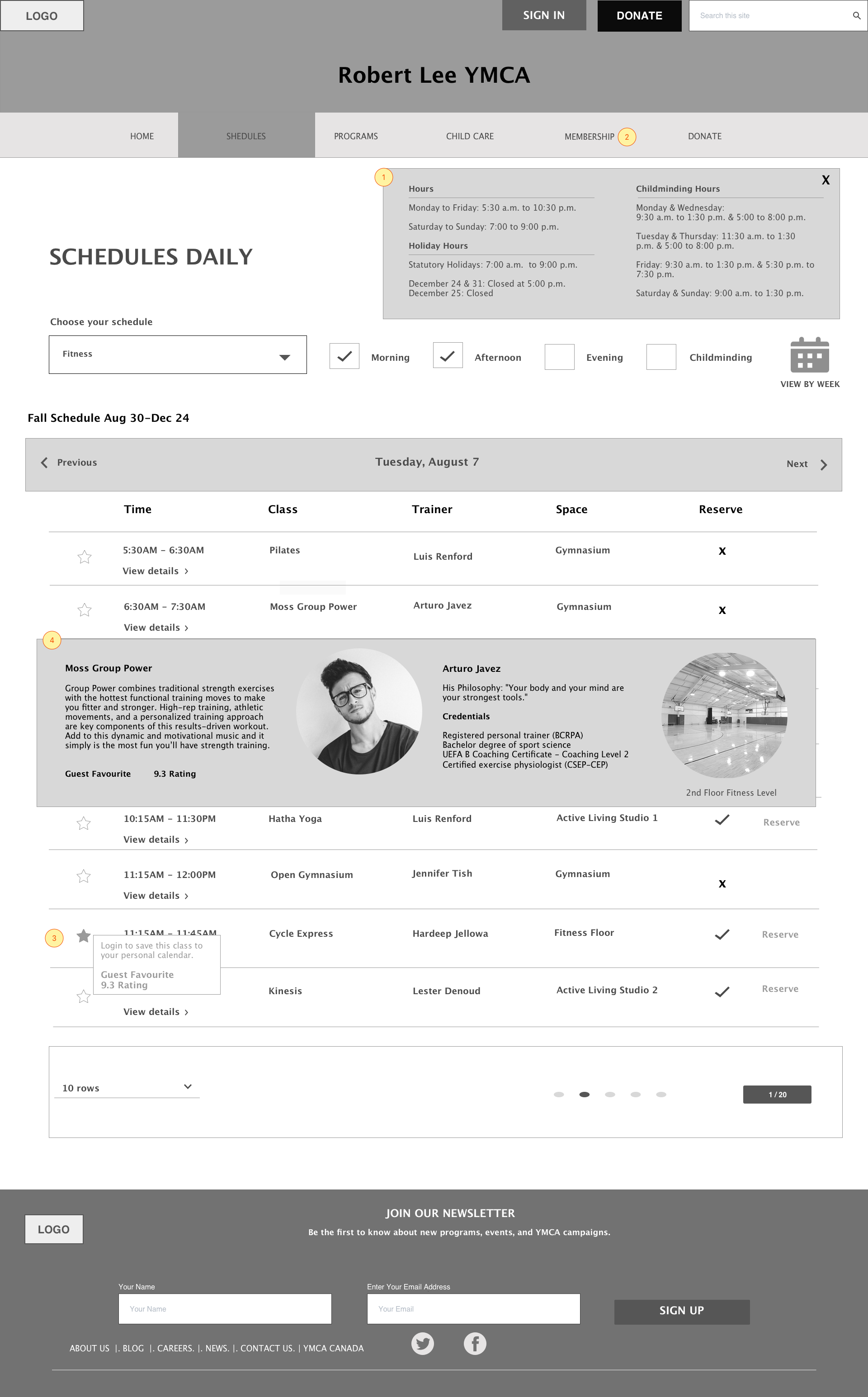


Solution: To reduce cognitive load, task interruptions, and the need for memorization of schedules/hours information, I added an additional filter for childminding in the schedules section. With this option chosen, only classes that coincide with childminding would be shown.
2 The YMCA does not currently allow users the opportunity to reserve classes. I discovered in my interviews that this is especially difficult for families who are using childminding services. Some classes begin at the same time as childminding and parents have to juggle getting kids to the right room, making sure they are settled, rushing downstairs to find a place in the class, then rushing to grab the equipment necessary for the class. While multi-tasking may be a norm for parents, easing their experience by giving them the ability to reserve their place would help cut down on some of the stress they currently experience.
Solution: Provide the possibility to reserve at least some classes.
Information Architecture | Metadata
An analysis of YMCA’s metadata demonstrated:
- Same meta descriptions for different pages
Meta tags provide the opportunity to advertise page content to target audiences as they browse through SERPs. Identical meta tags are unhelpful to searchers.
Solution: Meta descriptions and title tags should be unique for every page and relevant to the page they are describing. Include keywords specific to the page being targeted and offer descriptions that target audiences would want to click.
Follow one of the approaches below when creating title tags:
A) Primary keyword, secondary keyword, variation of primary keyword.
B) Primary keyword, secondary keyword (for branding).
Keywords phrases should be separated with a comma (,) or a vertical bar (|).
- Meta descriptions not being displayed
Many of the meta tags applied are not being displayed in Google. Having too many pages with duplicate title & meta tag descriptions that do not accurately reflect the content of a page may result in search engines indexing the wrong page, and bypassing existing meta descriptions.
Solution: Include the core keyword phrases used in the page copy in meta tags. Search engines are more likely to use tags as they are when crawlers find the matching copy in your content descriptions.
- Meta Keywords
No longer considered important or best practice.
- Alt Tags
Alt tags applied inconsistently. Search engines cannot see images, they can tell that images exist because of the HTML code, but descriptions and alt tags tell them what images are about. Alt tags are important for web accessibility. Visually impaired users that use screen readers use the alt tag attribute to understand the content of images on your page. Alt tags will also tell what an image is about when an image file does not load properly.
Solution: Apply alt tags consistently
Alt tag best practices:
Provide specific detail about the image. Imagining explaining the image to someone who can’t see.
Stay around 125 characters, short. Use longdesc=”” tag for longer more complex image descriptions.
Don’t start with “image of” or “picture of” using an alt tag already means you are going to describe an image.